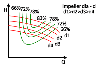
This is the combined curve. That means, it has a combination of curves that we have studied so far. Note:- in this curve, I have not added NPSH curve as it was not practical to put it from visibility and clarity of the graph.
Most of the time, manufacturer will be providing this graph. Here we can see different parameters such as power, flow, head and efficiency in one single graph.
It is very important to learn this graph as most of the problems on field related to pump and pumping system can be solved by studying this graph along with the data taken on site.
This graph also helps to explore the possibility of energy conservation. This is an excellent tool to understand and implement energy saving measures. In this version, we will not be focusing on this topic, but just for reader to understand I am giving following example.
Suppose we have an old system which was designed during project stage.The system has a single pump pumping water to an overhead tank at the rate of 200 cu. m/hr. And as a safety, the o/h tank was allowed to overflow at the rate of 20 cu.m/hr back to the supplying tank. Initially, this pump must have been selected to operate near BEP (Best Efficiency Point). Along the years, due to system improvement, head was reduced (one heat exchanger is removed which reduced the frictional head, this will shift operating point further right of BEP).Due to this, 10cu.m/hr more water is pumped to o/h tank. This means now o/h tank is overflowing 30cu.m/hr of water. Now if the system runs as it is, operating point has shifted to right side of BEP. This means efficiency will be reduced. If we throttle discharge valve, we can bring back the operating point back to BEP. At BEP, eff was 75% and pump was operating to right of BEP at 66% eff, so by throttling, we can save 9% of energy (only from efficiency). Actually, power savings will be more as duty point has shifted towards left, where power consumption has also reduced.


